We Put AI Design Tools to the Test on a Real Project—Here’s How They Performed
May 28, 2025
At Devblock, we believe design should move with both speed and substance. AI can play a powerful role in helping us get there, but only when it supports—not replaces—the creativity, empathy, and strategic thinking that human designers bring to every project. Our approach is to explore, test, and integrate AI tools where they add real value to the design process.
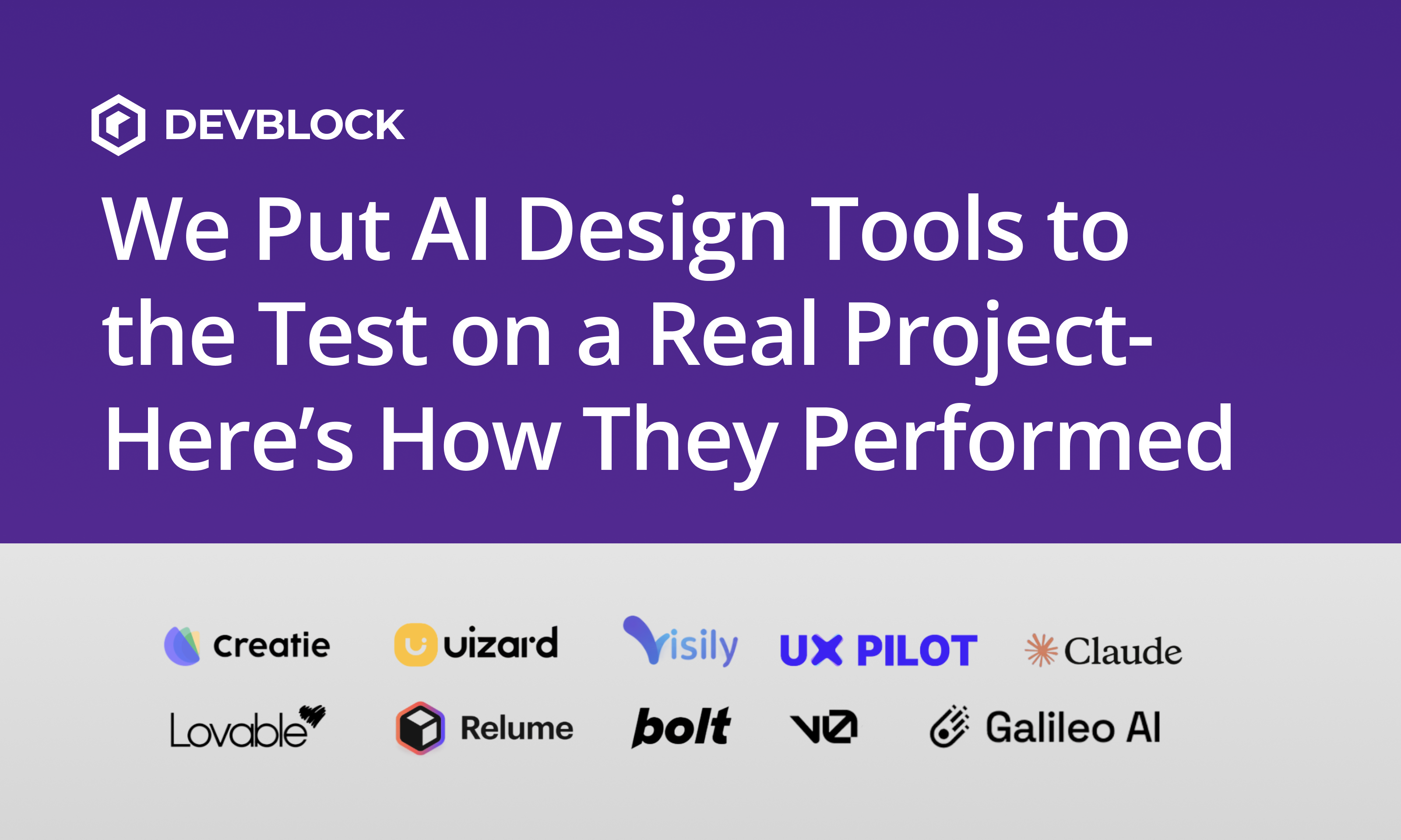
To see how far these tools have come, our design team put several AI-powered design platforms to the test on a real client project. We wanted to understand how each tool performed when applied to practical design challenges like wireframing, flows, and layout creation. Here’s what we discovered.
Rating: 9/10
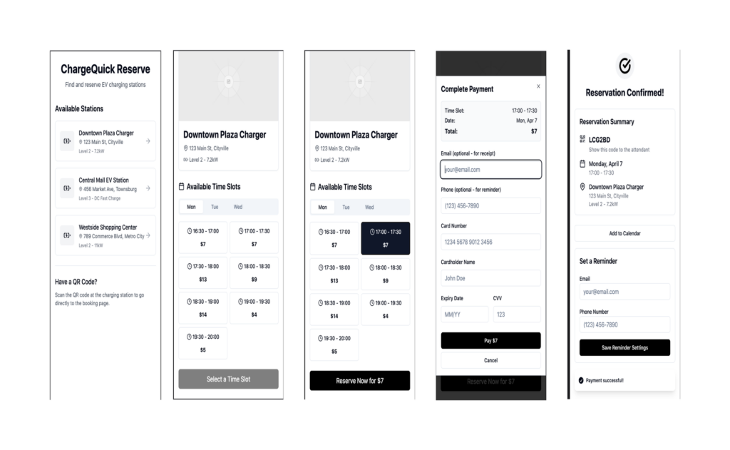
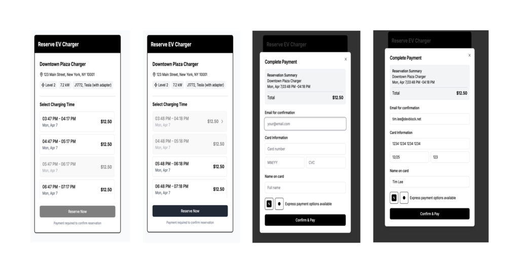
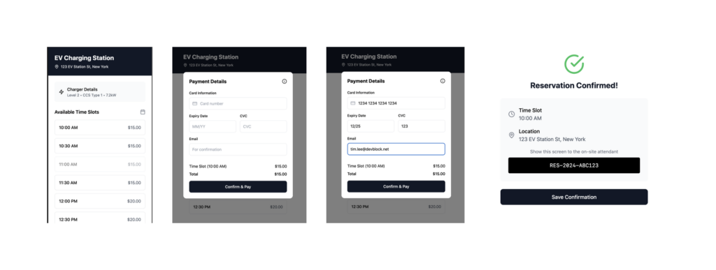
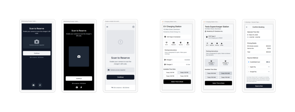
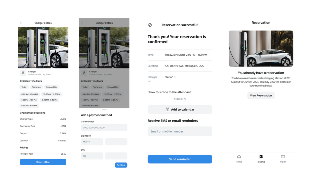
V0 immediately impressed us with its ability to generate usable wireframes and working prototypes in minutes. It didn’t just guess at layouts—it created logical, well-structured flows that reflected a solid understanding of user experience. We were also able to reference screenshots, make selective edits, and import assets directly into Figma, which saved time and reduced redundant setup.
What stood out most was how naturally it handled information hierarchy. V0’s AI seemed to recognize the relationships between different parts of the interface and translated them into an organized structure that felt intuitive. This made it easy to see how each screen fit into the larger flow, something that’s often missing from early-stage AI design outputs.
However, while it got us close to a solid starting point, it still required human refinement. The designs needed to be polished visually to meet Devblock’s standards for presentation and usability. Its coding logic, while efficient, sometimes introduced unnecessary complexity that designers had to simplify later. Overall, though, V0 felt like a real extension of the design process—a tool that saves time without compromising structure.
Rating: 9/10
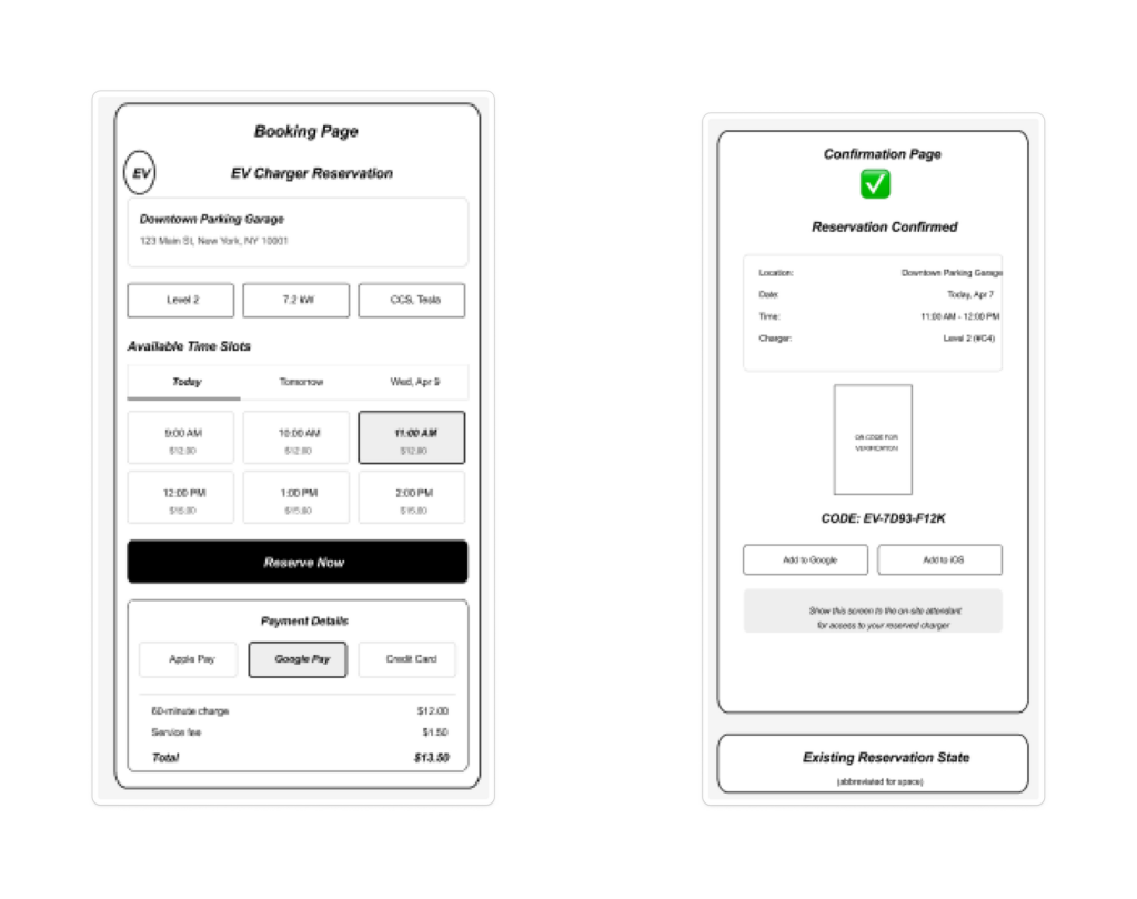
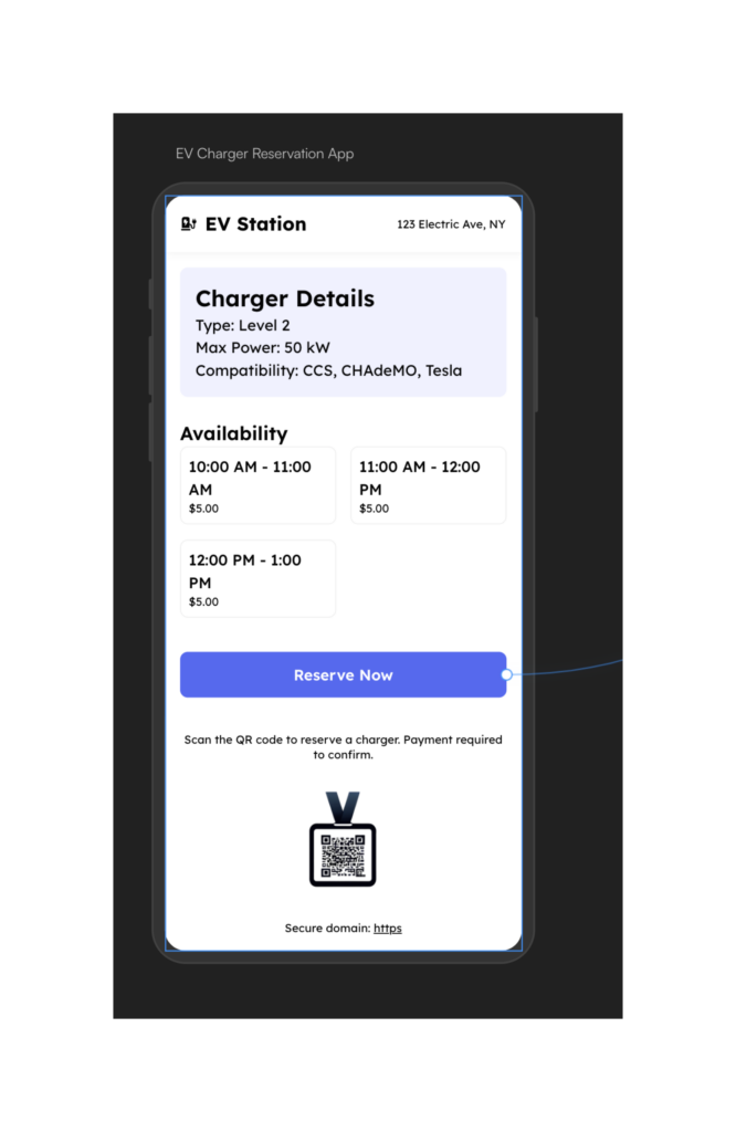
Lovable shared many of V0’s strengths but added a layer of warmth and personality. Its outputs were more visually expressive, offering layouts with color, contrast, and style that helped ideas come to life quickly. It was immediately clear how this tool could speed up the early phase of client discussions by turning concepts into something more tangible.
The beauty of Lovable is that it feels built with designers in mind. The interface is friendly, and the generated screens are balanced enough to serve as early prototypes or inspiration boards. During our testing, we noticed how it automatically applied design patterns that made sense for each project type—without the AI feeling too rigid or formulaic.
Still, Lovable has its limits. Like V0, it needed refinement in Figma to bring everything into alignment with existing brand systems. It’s a fast mover that gets you 80 percent of the way there, but the final 20 percent still needs that human judgment Devblock relies on to ensure consistency, accessibility, and craftsmanship.
Rating: 7/10
Claude took a very different approach from most tools we tested. Instead of producing editable wireframes or prototypes, it focused on static visuals. The results were conceptually interesting and occasionally artistic, but they weren’t ready for practical use. What we appreciated was how it interpreted prompts—it responded thoughtfully, offering ideas that pushed our thinking even if the execution wasn’t production-ready.
In a workflow, Claude feels less like a design tool and more like a collaborator during ideation. It’s useful when you want to explore broad visual territories or brainstorm creative directions before diving into actual structure. We could imagine using it in early creative workshops where the goal is to inspire rather than finalize.
The limitation was predictability. Because its visual outputs were static, designers had to reinterpret its suggestions manually. That makes Claude better suited for concept generation, moodboarding, or creative strategy than hands-on product design. It’s a thinker, not a builder.
Rating: 4/10
Bolt was one of the simplest tools to start using. It generated clean layouts quickly and connected multiple screens in a cohesive way. The process was smooth and approachable, which made it feel accessible for teams that don’t have a deep design background.
However, simplicity came with real trade-offs. The generated layouts were inflexible, and customization options were minimal. Once you had a design, there wasn’t much room to evolve it. The tool also lacked control over visual hierarchy and spacing, which meant designers had to spend additional time fixing what the AI produced.
In a professional environment, that lack of flexibility can slow teams down rather than speed them up. Bolt could be valuable for lightweight prototypes or non-critical design exercises, but for the kind of structured, scalable product design Devblock delivers, it didn’t meet the bar.
Rating: 6/10
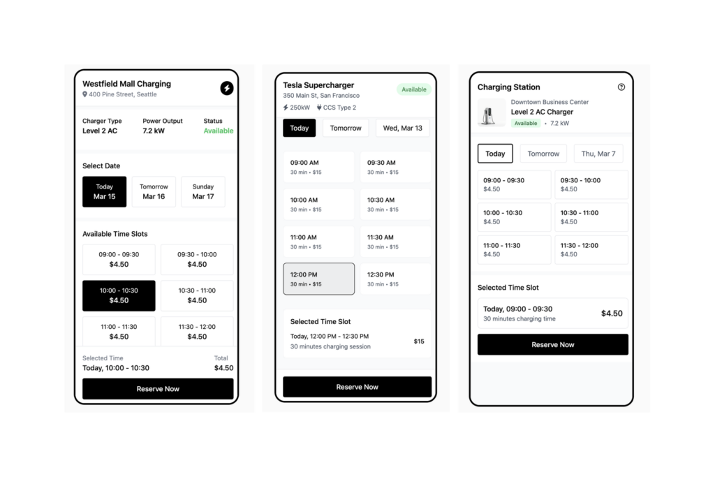
Relume stood out as a focused tool—it does one thing really well. It’s great for building and iterating on landing pages quickly. We liked its modular approach, which made it easy to swap sections, test variations, and see how small changes impacted the overall layout.
When used for marketing or campaign sites, Relume really shines. It reduces the friction of creating multiple variations and keeps visual consistency through reusable components. For designers working with content-driven projects, that efficiency is meaningful.
That said, its scope is limited. When we tried to extend it to multi-page applications or more complex UX flows, it quickly ran into boundaries. It’s a specialist, not a generalist. In the right context, Relume can be a valuable accelerator, but it’s not a replacement for design systems or full product architecture.
Rating: 6/10
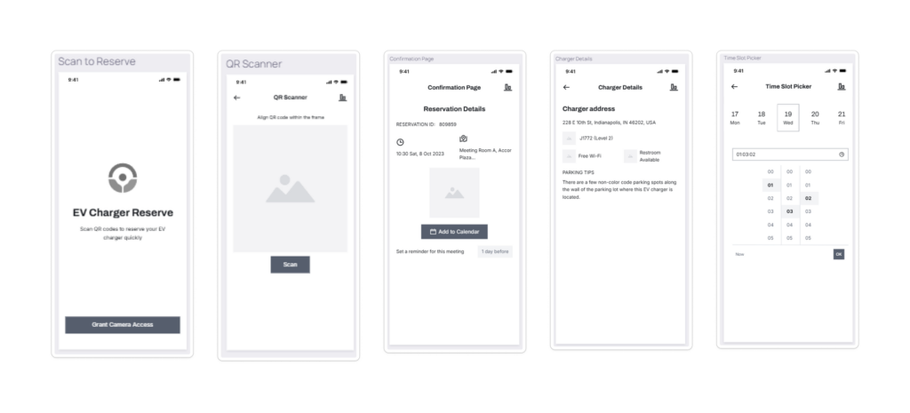
UX Pilot was among the fastest tools in our testing group. It generated wireframes and sitemaps from text prompts in seconds, making it ideal for early ideation and planning. The immediacy of seeing an idea visualized that quickly was genuinely helpful during sprint planning and workshops.
One of its strengths is how well it handles information architecture. UX Pilot can turn a set of user stories into a rough but clear sitemap, giving teams an early understanding of how different parts of an experience connect. This makes it a great companion for UX researchers and product strategists.
Its downside lies in execution. The generated screens were often too simple or disconnected from one another, and refining them into cohesive user flows required manual intervention. For Devblock, which prioritizes seamless usability and consistency, that meant extra work. Still, for a fast start or creative brainstorming, it’s a useful addition.
Rating: 4/10
Uizard approached AI design from a more visual perspective. It produced attractive, styled screens with thoughtful color choices and a sense of composition. For early art direction, that visual sensibility was valuable, especially when clients wanted to see options quickly.
In our tests, we appreciated its focus on aesthetics, but it didn’t extend well to multi-screen journeys or detailed user flows. Each screen had to be built individually, which slowed down the process for larger projects. The handoff between screens lacked cohesion, and reusing design patterns was cumbersome.
We see Uizard as a good fit for small creative projects, single-page concepts, or mood exploration. In a professional product environment, however, it’s more of a visual sandbox than a design system builder.
Rating: 4/10
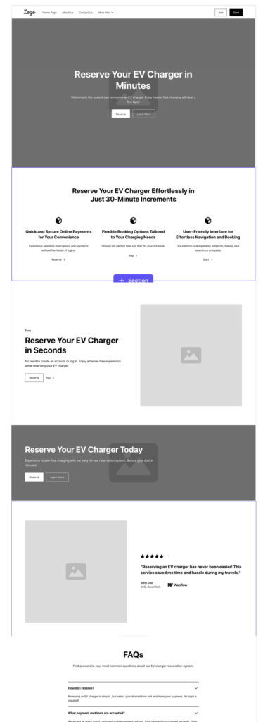
Visily AI offered speed and convenience. It came loaded with ready-made UI components and stock visuals, allowing us to create wireframes almost instantly. It’s a tool built for rapid idea generation, and in that respect, it did its job.
The challenge is that speed sometimes came at the cost of originality. Many outputs looked templated, and layouts often lacked the nuance that makes a design feel truly intentional. Adjusting visual hierarchy or flow required extra effort, which defeated the purpose of automation.
We think Visily AI has potential for non-designers who need quick visuals for documentation or presentation. For agencies like Devblock, where every pixel serves a purpose, it simply didn’t offer the flexibility or depth needed for serious design work.
Rating: 6/10
Creatie offered a nice balance of visual polish and usability. It quickly generated attractive, styled screens that felt more aligned with professional standards. The interface was intuitive, and the AI’s understanding of basic design principles was surprisingly solid.
In practice, we found it especially helpful when exploring different visual themes or directions. For art direction, Creatie felt like an effective brainstorming partner. However, when it came to interaction design or connecting multiple screens, it hit a wall. The tool focused on aesthetics rather than flow, which limited its value in a UX-driven process.
Still, for teams who need to experiment with look and feel before committing to a full system, Creatie could be a time-saver. It’s visually strong but structurally light.
Rating: 6/10
Galileo AI stood out for its aesthetic quality. The screens it generated had a natural sense of spacing, balance, and color composition that many other tools struggled to match. Visually, it was one of the most refined options in the entire test.
Where Galileo fell short was scalability. It excelled at creating one beautiful screen but struggled to maintain consistency across a full flow. We also found that while it was easy to ideate with, it wasn’t as easy to edit or customize the output afterward.
Still, Galileo feels like a step toward the kind of design assistant many teams are hoping for—something that doesn’t just produce layouts but understands visual intention. It’s not there yet, but it’s moving in a promising direction.
None of these AI tools can yet replace human designers—but the best ones can significantly augment our speed, output, and ideation process.
With the right tools in our stack, we were able to create finished wireframes 60% faster—something that would traditionally take much longer. AI helped us move faster without cutting corners on usability, quality or structure.
V0 and Lovable stood out for their ability to generate structured, interactive flows that were actually usable. Relume and UX Pilot excelled at early ideation, while Galileo, Creatie, and Uizard offered valuable design direction for single screens or themes.
The tools that underperformed typically fell short on flexibility, flow design, or production-level quality.
We’ll continue testing and experimenting—but AI is already playing a meaningful role in our design process, helping us move faster and think bigger.
Curious how AI tools could enhance your next product design?
Let’s talk about how we blend hands-on UX expertise with cutting-edge AI tools to create smarter, faster, more adaptive digital experiences.
Contact us to start your next project—enhanced by AI.