Figma’s inherent capabilities are amazing for product design and remote team collaborations, but what is its superpower? To me, it’s the Design System. Before Figma, I spent years trying to design applications without a central repository for all of my atoms, molecules, elements, assets, etc. I wasted so much time trying to redraw CTAs in multiple states and tirelessly hand-drew icons because I could never find a complete pack for whatever I was creating.
The Design System revolutionizes how designers’ approach not only product design but also extends its capabilities to other projects, such as pitch decks. The efficiency, consistency, and collaborative features of Figma’s Design System make it an invaluable tool for a wide array of design tasks. Last month my team asked me if we could design our presentations in Figma because they sometimes struggle with PowerPoint. So, I challenged my crew to come up with a system for presentation slides, with all the bells and whistles that Figma offers, like variables, color schemes with text options, and swappable graphics. What they delivered was amazing.

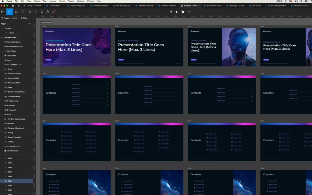
Figma Design System for decks.
Streamlined Consistency Across Projects
A central tenet of any design system is the ability to maintain consistency and scale. In Figma, this is achieved through reusable components and styles that can be shared across different projects. As for our presentation decks, we wanted to use the same features and functionality that we use for product design. For example, instead of creating dozens of button styles we created slide styles with 3 colors and reverse text: dark purple with white text (our brand colors), black with white text and white with black text. Since Figma is a true design tool, we noticed that a simple thing like text was much cleaner and crisper than PowerPoint and other presentation tools. The dark UI was very slick. We also noticed it was much easier and quicker to align the text, as Figma handles text much better than PowerPoint or Keynote.
Efficient Design Workflow
One of the most significant advantages of using Figma’s Design System is the efficiency it brings to the workflow. Designers can quickly drag and drop pre-made components, which speeds up the process and reduces the likelihood of errors. This efficiency is even more on display when spinning up a new deck.
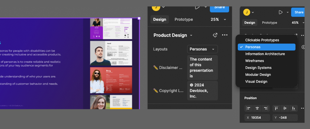
One of the benefits I’m loving is the use of variables. After I drop my slide on my projects frame, I can quickly select the content for that slide from pre-made marketing copy that we popped in the master file.
This allows me to quickly change a layout without having to reformat anything. I’m literally done in seconds. Now, I can continue to go through our slide templates and layout the structure and story for my deck in minutes. For me this is crucial when working on tight deadlines or when multiple iterations are required. For pitch decks or RFP responses, this means that I can focus more on the content and storytelling aspects rather than getting bogged down by repetitive design tasks like text alignment and formatting.

Seamless Collaboration
Figma is renowned for its collaborative features, allowing multiple team members to work on a project simultaneously. This is particularly beneficial for remote teams, as it eliminates the need for constant back-and-forth communication and file sharing. Today, it seems like every potential new client needs a presentation with a ridiculously short turnaround. This is when I call in my teammates to divide and conquer. I might stub out the content and order of the slides and work solely on the story I’m trying to tell and have one of my designers work on bringing in custom infographics or research to flesh out the presentation. Figma allows us to get this done in days as opposed to weeks.
Back in the day, I had teams of designers working in Keynote, emailing graphics, copywriters emailing word docs and creative directors crafting the story in house. It took forever to gather all that content.
Not only is this custom Figma file formatted and laid out perfectly but it’s also a design system, meaning ALL the branding, text styles, graphics, everything, is in this central library. None of this is possible in Keynote and PowerPoint. Believe me, I’ve tried so many different ways of creating a master deck, but nothing compares to this.
The design system acts as a single source of truth, ensuring that everyone is on the same page. For pitch decks, this collaboration can extend to marketing teams, sales departments, and executives, ensuring that the final presentation aligns with the team’s goals and messaging. Each team member can leave comments that will drop into the designs. Our deck doesn’t get blown up by folks that paste copy into a presentation and destroy our consistent style or formatting.
Scalability and Adaptability
As projects grow and evolve, the design system in Figma can scale accordingly. New components and styles can be added, and existing ones can be modified without disrupting the overall system. Nothing utilizes this feature better than updating and adding slides to the master deck. When our team was working in PowerPoint, each presentation needed custom slides that focused on the pitch, so we had new and powerful information being added per deck. After that presentation was completed, I would want to add those new slides to our master deck. Not really a hard task, however, a dozen decks in flight can be overwhelming and inevitably something will get overlooked or simply forgotten. This can be easily done now with components. And, oh, how easy it is to update a slide like the Team Members. If we need to add or replace a team member or their bio changes, we just update the master component/instance and ALL decks get that update.
This scalability is crucial as new features are added and presentations evolve. For pitch decks, this means that as the company’s branding and messaging change, the design system can be easily updated to reflect these changes, ensuring that all presentations remain current and relevant.
Conclusion
A design system is more than just a tool for product design; it is a comprehensive solution that enhances efficiency, consistency, and collaboration across various design projects. By no means is it the end of my search for the ultimate workflow. There are still some pitfalls with Figma, like exporting multiple frames to PDF (they still haven’t nailed that). However, after 20 years of working in creative teams, this new cloud based paradigm of sharing and collaborating is by far the best experience I have had working with others.


